
Aidlab SDK brings new features for Python like signal filtering or adding exposure to the workout detector module. This is a huge step as it opens up new possibilities for creating even more ambitious projects. Let's see what data filtration means for respiration-based projects.
An impedance respiration sensor built into the Aidlab gives you all sorts of interesting data like respiration rate or current ventilation level. For example, it allows you to build a Birds clone, a game where the bird is controlled by the signal from your lungs.
In Aidlab SDK filtration is enabled by default, so we will end up with a relatively simple code for starting the respiration measurements:
from aidlab import AidlabManager, DeviceDelegate, DataType

class MainManager(DeviceDelegate):
    async def run(self):
        devices = await AidlabManager().scan()
        if len(devices) > 0:
            print("Connecting to:", devices[0].address)
            await devices[0].connect(self, [DataType.RESPIRATION])
            while True:
                await asyncio.sleep(1)

    def did_connect(self, device):
        print("Connected to:", aidlab.address)

    def did_disconnect(self, device):
        print("Disconnected from:", device.address)

    def did_receive_respiration(self, device, timestamp, values):
        print(values)

asyncio.run(MainManager().run())
Create respiration-plotting.py, paste the above snippet into the file, and create the folder structure as follows:
SleepDetector/
  |-- respiration-plotting.py
Install the Aidla Python bSDK with pip installer:
pip install AidlabSDK
In this tutorial, we are going to visualize the sampled data. For this purpose, we will use the matplotlib, a Python module for creating graphs. Matplotlib has many tools to draw various charts easily and quickly. It’s very useful for presenting results obtained using Aidlab, and also for visualization of input data which significantly helps to understand the problem that we need to solve and how our models/algorithms work.
Install the matplotlib with pip installer:
pip install matplotlib
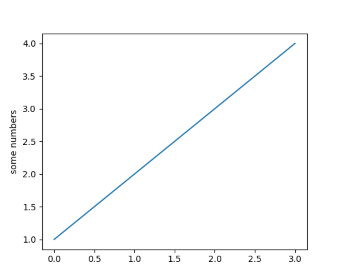
The good thing about matplotlib is that it has a really simple API to render plots:
import matplotlib.pyplot as pyplot
pyplot.plot([1,2,3,4])
pyplot.ylabel('some numbers')
pyplot.show()
The most important function, plot, takes an array of samples in order to visualize the input:
Plotting data in real-time
Data from Aidlab comes in as a stream, meaning we have to figure it out how to update our plot in real-time - this is related to redrawing the plot with new data, constantly. To achieve that, we are going to present two methods for real-time plotting: one with the FuncAnimation and one without.
FuncAnimation
Using FuncAnimation is relatively simple, as this method expects three parameters:
figurethat we want to plot,- function that will modify the plot,
- rendering interval (in milliseconds).
So this will end up with:
figure = pyplot.figure()
axis1 = figure.add_subplot(1,1,1)

animation.FuncAnimation(figure, animate, interval=2)
pyplot.show()
where animate is defined as follows:
def animate(self, i):
    global y
    axis1.clear()
    axis1.plot(x, y)
The x and y are lists containing the current position and sample of the respiration.
ion
On the other hand, we have an old way with the ion method from matplotlib.pyplot.
ion enables interactive mode, so from now on we will have dynamically updated data:
def live_plotter(self):

    if self.line == []:

        # This is the call to matplotlib that allows dynamic plotting
        pyplot.ion()
        self.fig = pyplot.figure(figsize=(13, 6))
        axis = self.fig.add_subplot(111)

        # Create a variable for the line so we can update it later
        self.line, = axis.plot(self.x, self.y, '', alpha=0.8)
        pyplot.show()

    # After the figure, axis, and line are created, we only need to update the
    # y-data
    self.line.set_ydata(self.y)

    # Adjust limits if new data goes beyond bounds
    pyplot.ylim([np.min(self.y) - np.std(self.y), np.max(self.y) + np.std(self.y)])

    # This pauses the data so the figure/axis can catch up - the amount of pause
    # can be altered above
    self.fig.canvas.flush_events()
Let's create a function that will redraw our data every constant interval:
    def did_receive_respiration(self, device, timestamp, values):

        self.sample_index += 1

        chart_refresh_rate_in_milliseconds = 100
        # shift left
        self.y[:-1] = self.y[1:]
        self.y[-1] = values[0]

        if self.current_time_in_milliseconds() - self.time > chart_refresh_rate_in_milliseconds:
            self.time = self.current_time_in_milliseconds()
            self.live_plotter()

def current_time_in_miliseconds(self):
    global second_in_miliseconds
    return int(round(time.time() * second_in_miliseconds))
Full code is available on Github.
Running the above code invokes the action for listening to nearest device. After successful pairing you should see a chart similar to:
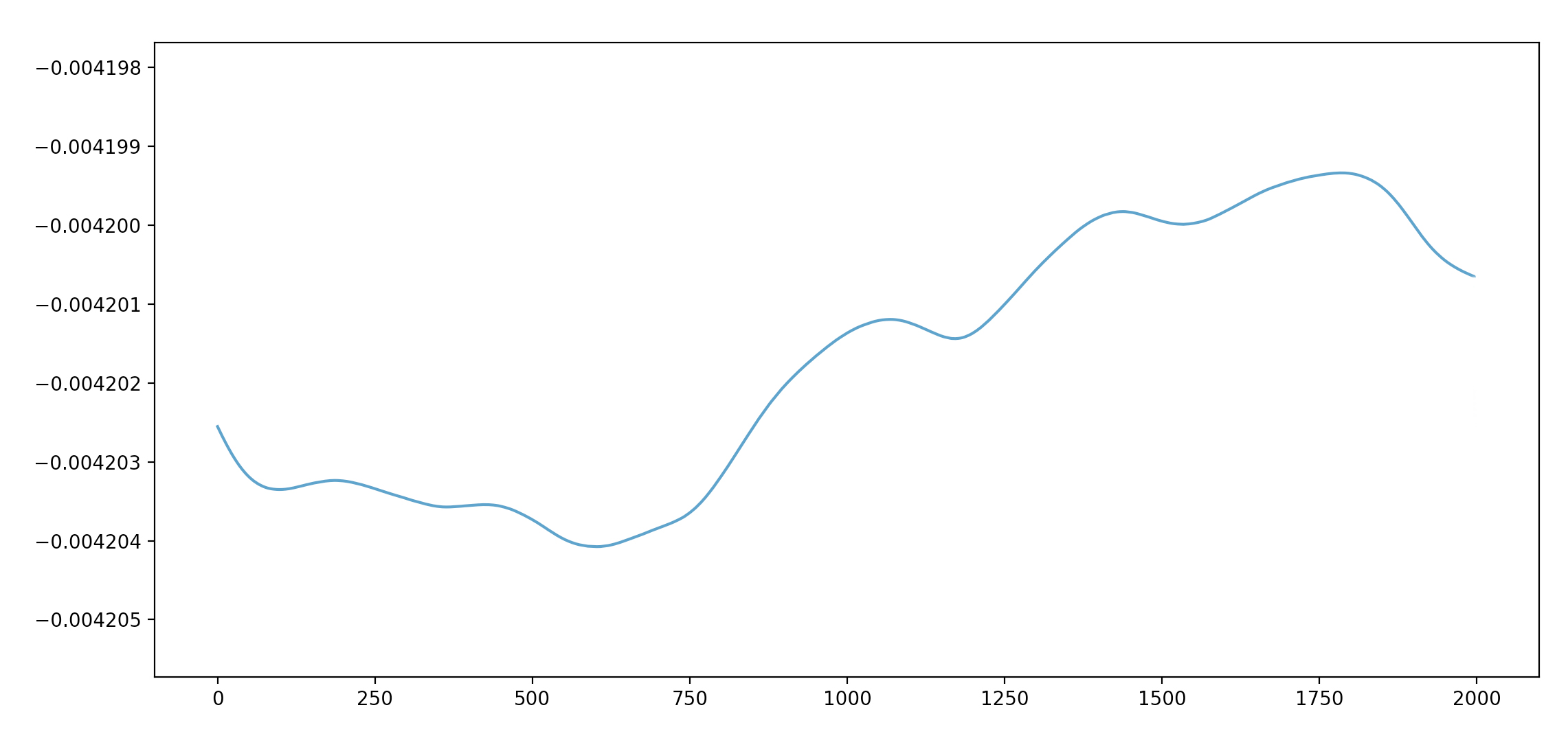
The ups and downs represent the inhaling and exhaling routine.
If you’re eager to discover more from matplotlib, consider checking out tutorials from the official website of matplotlib.